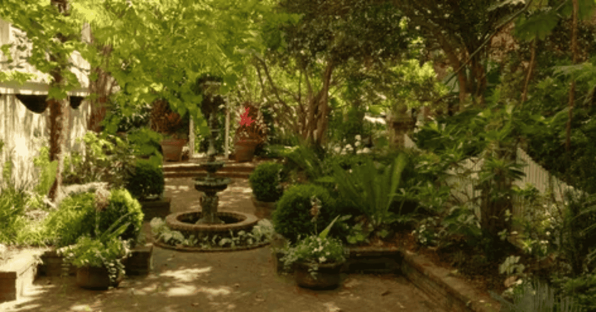
There’s something strangely satisfying about stepping outside and seeing a space where colors actually make sense together. Sometimes we don’t notice it right away—it’s just a feeling of calm, or energy, or balance. Other times, it’s obvious: that splash of violet against green leaves, or the way orange flowers catch the last light of day. And that’s really what Color Themes for Your Outdoor Garden are about. They’re less about rigid rules and more about creating moods.
I remember visiting a friend’s backyard one summer evening. She had arranged her garden so that the flowers closest to the patio were deep purple and pale blue. As the sun dipped, those shades seemed to cool the air itself. Further out, though, by the fence line, fiery tones took over—yellows, reds, oranges. The whole effect was like walking through different rooms without ever leaving the yard. That was the first time I realized how intentional use of garden color palette can transform an outdoor space.
Why Color Matters in Outdoor Garden Design
We often think of plants in terms of survival—watering, sunlight, soil. But colour? That’s the part that turns a backyard into something personal. Color influences mood. A row of lavender-blue blooms creates a serene atmosphere. A cluster of golden marigolds feels cheerful. Rich reds and oranges bring drama.
When you start thinking about Color Themes for Your Outdoor Garden, you’re essentially deciding what kind of atmosphere you want to walk into each time you step outside. Do you want a calming retreat? A vibrant party space? Something that shifts with the seasons?
And here’s the funny thing—sometimes we don’t even realize we’re craving a certain mood until the colors show up.
The Basics: Understanding a Garden Color Palette
Before diving into cool blues or sunset shades, it helps to understand a few basics.
-
Complementary colors (opposites on the color wheel) create striking contrasts. Think orange marigolds beside purple salvia.
-
Analogous colors (next to each other on the wheel) create harmony. For example, blues and purples flowing together.
-
Neutral tones (greens, whites, silvers) can tie everything together, giving the eye a place to rest.
In outdoor garden design, this isn’t about rules so much as tools. Once you know how colors play together, you can decide whether to aim for contrast, calm, or boldness.
Cool Blues: Calming Garden Hues
There’s a reason blue is linked with peace. Blue flowers, though rarer in nature than yellows or reds, carry a sense of quiet elegance. Planting delphiniums, hydrangeas, or lobelias in a border can cool down a sunny space both visually and emotionally.
A Wildlife-Friendly Garden may depend on pollinator plants, but even there, a splash of cool blues can add serenity. They’re perfect for evening gardens too, since pale blues and silvery leaves reflect moonlight beautifully.
Blue tones pair well with whites and silvers, creating that classic “twilight garden” feel. If you’ve ever looked at Peace Lilies indoors, you’ll know how white blooms can calm a space. Outdoors, the same principle applies: balance the color palette to ease the mood.
Sunset Shades: Vibrant Garden Themes
On the other end of the spectrum are the bold, fiery tones—reds, oranges, pinks, yellows. These sunset shades inject life into any space. Think of zinnias, marigolds, dahlias. They carry warmth and energy, perfect for entertaining areas or patios where gatherings happen.
These colors are excellent for colorful landscaping that feels joyful and inviting. A border lined with orange lilies and golden rudbeckias will always draw attention. Pair them with rich green foliage for balance, and you’ve got a visual feast.
The mood here is less about calm and more about vitality. If you want your garden to feel alive, sunset tones rarely disappoint.
Seasonal Garden Colors: Shifting With Time
One overlooked aspect of Color Themes for Your Outdoor Garden is timing. Spring may lean toward fresh pastels—pale pink tulips, soft yellow daffodils. Summer explodes with intensity. Autumn, of course, leans toward deep oranges, reds, and browns.
Designing with seasonal garden colors means planning for change. Maybe you start with tulips and pansies in early spring, transition to roses and sunflowers in summer, and end with chrysanthemums in fall. The garden becomes a living calendar.
This shifting color journey keeps things interesting, so your space doesn’t feel static.
Creating Garden Mood With Color
Every color theme creates a different garden mood.
-
Blues and purples: tranquility, reflection.
-
Reds and oranges: energy, warmth.
-
Whites and greens: elegance, simplicity.
-
Mixed brights: playfulness, joy.
It’s worth asking: what do you want to feel when you step outside? Your answer may surprise you. I once thought I wanted a “calm” garden until I realized I was planting bold reds every spring. Turns out, I craved energy instead.
Plant Color Combinations That Work
Some of the most effective plant color combinations aren’t complicated at all.
-
Blue salvia with yellow marigolds—calm meets cheer.
-
Purple coneflowers with orange zinnias—contrast that pops.
-
White daisies with pink roses—classic softness.
-
Red geraniums with silver lamb’s ear—bold yet grounded.
If you’re ever in doubt, plant green between colors. Green is the constant, the backdrop that makes every hue feel anchored.
Harmonious Garden Design: Finding Balance
While bold gardens are beautiful, too much intensity can overwhelm. That’s where harmonious garden design comes in. Balance bright flower colors with calming neutrals. Add white or silver-leafed plants to give the eye a break.
This doesn’t mean watering down your vision. It means giving yourself (and your visitors) room to breathe. A garden should feel like it unfolds, not like it shouts all at once.
Color Themes in Small or Urban Gardens
Even small yards or balcony spaces can carry strong aesthetic garden styling with the right use of color. Pots of cool blues arranged along a railing can create calm in a noisy city. A cluster of fiery geraniums can brighten a tiny patio instantly.
Urban gardening is often about doing more with less. Using color intentionally is one of the easiest ways to maximize impact without needing more space.
Outdoor Décor and Color
Plants aren’t the only way to bring color into your garden. Furniture, cushions, pots, and even fences contribute to the overall garden color palette. A simple terracotta pot beside violet flowers changes the entire tone of a corner.
And if you’ve ever experimented with indoor greenery—say a Christmas Cactus or Money Tree—you know that containers themselves play a role. Outdoors, it’s no different. A painted bench or a cobalt pot can anchor the scheme.
Color Themes for Your Outdoor Garden: Bringing It All Together
The joy of working with color is that there isn’t just one right answer. Color Themes for Your Outdoor Garden can be soft and subtle, or bold and dramatic. They can shift with the seasons or stay consistent year-round.
The point isn’t perfection. It’s experimentation. Some combinations will sing, others may clash—but even clashes can teach you something. And over time, your space will evolve into something uniquely yours.
And here’s a reminder: gardening isn’t just about plants. It’s about the mood you create, the people you welcome, and the quiet moments you enjoy alone. If your color choices give you that, then you’ve succeeded.
🌱 Final Thought
Choosing the right Color Themes for Your Outdoor Garden isn’t about following strict design rules—it’s about feeling. Some days you might crave the serenity of cool blues, other times the warmth of sunset shades feels right. The beauty of gardening is that it evolves, just like we do. Your outdoor space doesn’t need to be perfect; it just needs to reflect the moods, memories, and moments you want to create. In the end, the colors you choose aren’t just for your garden—they shape how you experience it.
🌿 Key Takeaways
-
Color sets the mood — calming garden hues like blues bring peace, while bold garden colors like reds and oranges add energy.
-
A balanced garden color palette combines contrasts, neutrals, and harmonious blends for a space that feels cohesive.
-
Seasonal garden colors keep things fresh — pastels in spring, vibrant tones in summer, rich shades in autumn.
-
Small yards and urban gardens benefit from color themes, maximizing impact even when space is limited.
-
Outdoor décor ties it together — pots, furniture, and accessories can reinforce or balance your plant color combinations.
❓ FAQs
Q1. How do I choose the right color theme for my outdoor garden?
Start by asking what mood you want—calm, vibrant, elegant, or playful. From there, build your garden color palette with plants and décor that reflect that feeling.
Q2. What are the best calming garden hues?
Blues, purples, whites, and silvery foliage create a tranquil atmosphere, ideal for relaxation areas.
Q3. Can small yards still use bold garden colors?
Yes. Even a few pots with vibrant sunset shades or bright flower colors can transform limited spaces into lively focal points.
Q4. Should I stick to one theme throughout the year?
Not necessarily. Many gardeners enjoy using seasonal garden colors so the space evolves from spring to autumn.
Q5. How can outdoor décor help with colour themes?
Pots, cushions, fences, and even garden furniture can echo or contrast with your plant colours, enhancing your harmonious garden design.